
Table of Contents
- What Makes Quality Screen Printing Worth Your Money
- Building Your Screen Printing Quality Checklist
- Signs of a Bad Screen Print You Should Avoid
- Screen Print Durability Test: Does It Hold Up?
- How to Wash Graphic Hoodies to Preserve Print Quality
- Questions to Ask Your Screen-Printing Provider
- Fabric, Ink, and Design: The Foundation of Quality
- Frequently Asked Questions
Last Updated: October 9, 2026
What Makes Quality Screen Printing Worth Your Money
What separates a print that lasts from one that cracks and fades is execution: ink coverage, fabric compatibility, and curing temperature, the foundation of spot quality screen printing.
This guide shows how to spot quality screen printing before you buy, and keep it sharp after.
Building Your Screen Printing Quality Checklist
Evaluate a screen print with a checklist covering three things: visual consistency, ink adhesion, and durability.
Examine the print under good lighting for uneven coverage, thin spots, or fading. Feel it: ink should be smooth and flexible, not stiff or cracking. Press the edges, lifting or peeling is a red flag.
Visual Inspection: What to Look For
A quality screen print shows consistent ink coverage, no thin spots, no fading into the fabric.
Look for these specific markers:
- Color saturation: The ink color matches the design file. No washed-out or overly dark spots.
- Edge definition: The edges of the design are clean and sharp, not fuzzy or bleeding into the fabric.
- Fine detail: Small text and thin lines are clear and readable. Halftone dots are evenly spaced and consistent.
Uneven ink is the most common defect, caused by inconsistent squeegee pressure or damaged mesh. Quality printers check screens regularly and hold consistent pressure.
The Feel Test: Ink Adhesion and Finish
A quality screen print feels smooth, moves with the fabric, and doesn't crack or peel when stretched.
Press your thumb on the print; it should flex without resistance. Stiff ink means the cure was too hot or the ink wasn't compatible with the fabric. Rub the design's border, lifting or flaking means poor adhesion.
Color Consistency Across the Print Run
Every piece in a multi-piece order should look identical; color drift signals poor quality control. For larger quantities, ask for a sample, then check the first, middle, and last pieces, color should match exactly. Inconsistency happens when the printer doesn't refresh ink or clean the screen between pieces.
Signs of a Bad Screen Print You Should Avoid
A bad screen print is obvious once you know what to look for: poor ink coverage, misalignment, and finishes that won't survive the first wash.
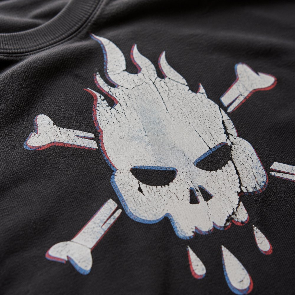
Common Print Defects and Severity Levels
Not all defects are equal.
Thin ink coverage, you can see fabric underneath, from too little ink or too much pressure.
Uneven saturation, some areas darker than others, from inconsistent squeegee pressure or a damaged screen.
Fuzzy or blurry details, low artwork resolution or off registration, making small text unreadable.
Registration Issues and Misalignment
Registration is when multiple colors line up perfectly; misalignment means screens weren't positioned correctly.
A shift under 1/16 inch is noticeable but acceptable; larger shifts ruin the design.
Tilt the print under light from multiple angles to spot offset colors.
Misalignment signals rushed work or equipment problems.
Screen Print Durability Test: Does It Hold Up?
A print that looks good on day one but falls apart after three washes is worthless. A repeatable protocol gives you a pass/fail answer instead of vibes.
Use the same garment, detergent, and wash settings every time so results are comparable.
The Six-Wash Protocol
Run this baseline test on a sample before committing to a full run.
- Baseline documentation. Photograph the print flat under even lighting with a ruler or coin for scale. Note dimensions and placement from the collar seam to the top of the print.
- Wash cycle. Turn inside out. Wash cold on a normal cycle with mild liquid detergent and like colors. Skip bleach and fabric softener.
- Dry cycle. Tumble dry low or air dry flat, pick one and stick with it, since heat exposure most affects cracking.
- Repeat. Run the full cycle six times. Six is the practical threshold where plastisol and water-based inks separate into "holds up" and "doesn't."
- Re-photograph. Shoot the same flat, lit photo at the same distance after wash six.
- Compare side by side. Put the before and after photos together and score against the criteria below.
Pass/Fail Criteria After Six Washes
Score each item pass, marginal, or fail. Two or more fails means the print isn't durable enough for a paid order.
- Color retention. Ink should still match the original within a visible-but-minor shift. Noticeable fading across the whole design is a fail.
- Edge integrity. Edges should stay sharp. Fuzzy, feathered, or lifted edges are a fail.
- Cracking. Hairline cracks along fold lines (armpits, chest, hem) are marginal. Cracks running through the design and exposing fabric are a fail.
Stretch, Flex, and Abrasion Checks
Washing is the long test. These three checks give a fast read on adhesion before any laundry.
Stretch test. Grip the fabric on either side of the print and pull taut for five seconds, then release.
Abrasion test. Rub the print firmly with your thumb for about ten seconds, then check your thumb.
What Each Failure Mode Actually Means
Different failures point to different root causes; knowing the cause helps you push back with specifics.
- Cracking along fold lines usually means the ink film is too thick or the cure was incomplete. A thinner deposit or different ink system fixes it.
- Peeling at the edges points to poor adhesion, often from fabric softener residue, insufficient curing heat, or an ink that doesn't match the fabric chemistry.
- Overall fading is usually a wash-and-wear issue, but severe fading after one or two washes suggests undercured ink or dye migration on synthetic blends.
Long-Term Tracking
If you're buying in volume, keep a log: order date, printer, ink type, wash count, and a photo at each milestone. After a few orders you'll have your own data on which printers and ink systems hold up, worth more than any single inspection.
How to Wash Graphic Hoodies to Preserve Print Quality
Once you've confirmed the print is quality, keep it that way, washing is where most prints fail.
Wash inside out to protect the print from friction, and use cold water; hot water speeds fading.
Dry on low heat or air dry; high heat damages print and fabric.
Questions to Ask Your Screen-Printing Provider
Before ordering, ask these questions. A quality printer answers confidently and specifically, but questions alone don't protect you. A documented approval process with agreed tolerances does.
The Pre-Production Questions That Actually Matter
What's your curing process, and how do you verify it? Ask about temperature and dwell time.
How do you handle color matching? Ask whether they match to a Pantone number, physical swatch, or digital file.
What's your registration tolerance for multi-color jobs? Ask how much misalignment they accept.
What's your policy on defects? Get replacement or credit terms in writing before you order.
Requesting a Proof and Approving a Strike-Off
A proof is not the same as a strike-off, and the difference matters.
A digital proof is a flat image of your artwork as the printer intends to print it.
A strike-off (or pre-production sample) is a physical print on the actual garment with the actual ink and screens, the only artifact showing real color, hand feel, and detail.
For any order where quality matters, approve a strike-off before the full run:
- Request the strike-off on the exact garment and color you plan to order. A sample on different fabric tells you almost nothing.
- Inspect it against the checklist in this article. Registration, edges, opacity, hand feel, placement.
- Wash it once using the protocol above. Confirm the print survives a single cycle before approving the run.
- Photograph and measure it. Record print dimensions, placement from the collar seam, and color under even lighting.
- Sign off in writing. Note approved dimensions, placement, and color reference, the standard the full run is measured against.
Documenting Tolerances Before the Run
Put these in writing before production starts. A short email confirmation is enough.
- Placement. Center of print within plus or minus 1/16 inch of the approved position on standard locations.
- Registration. Multi-color alignment within 1/64 inch.
- Color. Match to the approved strike-off under neutral lighting. Minor variation between pieces is normal; a visible shift across the run is not.
Quality Control Across a Production Run
A single good sample doesn't guarantee a good run. Color drifts as ink is consumed, screens degrade, and shifts change.
When your order arrives, pull three pieces: the first, one from the middle, and the last. Compare all three against the approved strike-off.
- Color. Hold them side by side under the same light. If the first and last differ visibly, the run drifted.
- Placement. Lay them flat and measure from the collar seam to the top of the print on each. They should match within your agreed tolerance.
- Registration. Check multi-color alignment on each piece, not just one.
If any of the three fails, ask the printer to explain the variance and how they'll correct it before you accept the rest of the order.
Red Flags in the Answers
- Vague answers about ink type or curing.
- No stated placement or registration tolerance.
- Refusal to provide a strike-off on the actual garment.
A printer with a real QC process welcomes these questions; one without gets defensive. Either response tells you what you need to know.
Fabric, Ink, and Design: The Foundation of Quality
Screen printing quality starts before ink hits the screen, with fabric choice, ink compatibility, and artwork preparation.
Fabric Composition and Ink Compatibility
Not all fabrics work equally well with screen printing.
A cotton-polyester blend is common for durability and cost.
Fabric surface matters too: a smooth finish holds fine detail better than rough texture, which causes uneven ink coverage.
A quality printer knows which fabrics work best for their inks and processes.
Artwork Resolution and Print Detail
Low-resolution artwork produces blurry, broken prints; high-resolution produces crisp, detailed prints.
Vector art (Adobe Illustrator) is ideal, it scales without losing quality. Raster art (Photoshop, JPEG) needs at least 300 DPI.
Color separation is how the printer breaks your design into individual colors. Poor separation causes color bleeding and registration issues; a quality printer checks separations before printing.
Frequently Asked Questions
How can you tell if a screen print is high quality?
High-quality screen printing shows even ink coverage with no thin spots, crisp edges without bleeding, and ink that feels firmly adhered to the fabric without excessive stiffness. Check for consistent color across the entire print, proper registration (design elements aligned correctly), and smooth halftones if the design uses them. Run your finger across the print, quality ink should feel like a natural part of the garment, not a layer that will crack or peel after a few washes.
What should I look for on a screen printing quality checklist?
Your screen printing quality checklist should include: ink opacity (no see-through spots), even coverage across the design, crisp edges without feathering, proper color separation, consistent pressure marks, correct registration, smooth surface finish, and no pinholes or thin spots. Also inspect for proper curing, the print should feel permanently bonded to the fabric. Test color consistency across multiple pieces if ordering in bulk, and verify the print placement matches your specifications.
How long should a quality screen print last?
The durability of a screen print depends on fabric quality, ink type, curing temperature, and washing methods. Always turn graphic hoodies inside out, wash in cold water, and air dry to maximize print longevity.
What are signs of a bad screen print I should avoid?
Avoid prints with uneven ink coverage, thin spots where the fabric shows through, bleeding edges that blur the design, poor color separation, or misaligned registration. Red flags include ink that feels overly stiff or plasticky, visible pinholes or gaps in solid areas, cracking before you've even washed the garment, and inconsistent color across the print run. If the print feels like it's sitting on top of the fabric rather than bonded to it, that's a sign of inadequate curing or poor ink adhesion.
Ordering from a printer who cuts corners feels cheap until the first wash. That's when you realize the quality gap between a rushed job and one done right. At Irreverent Ink, we partner with printers who understand that screen printing durability isn't negotiable. When you're investing in apparel that represents who you are, the print quality has to match the design. Shop with confidence, knowing every piece is built to last.